Rate maps for grid cells
27 Jul 2016
At CAMP@Bangalore, I worked on a small project that involved plotting rate maps for data recorded from grid cells. There has been some interest on how to do this from other students in the course, so I'm posting the relevant code here.
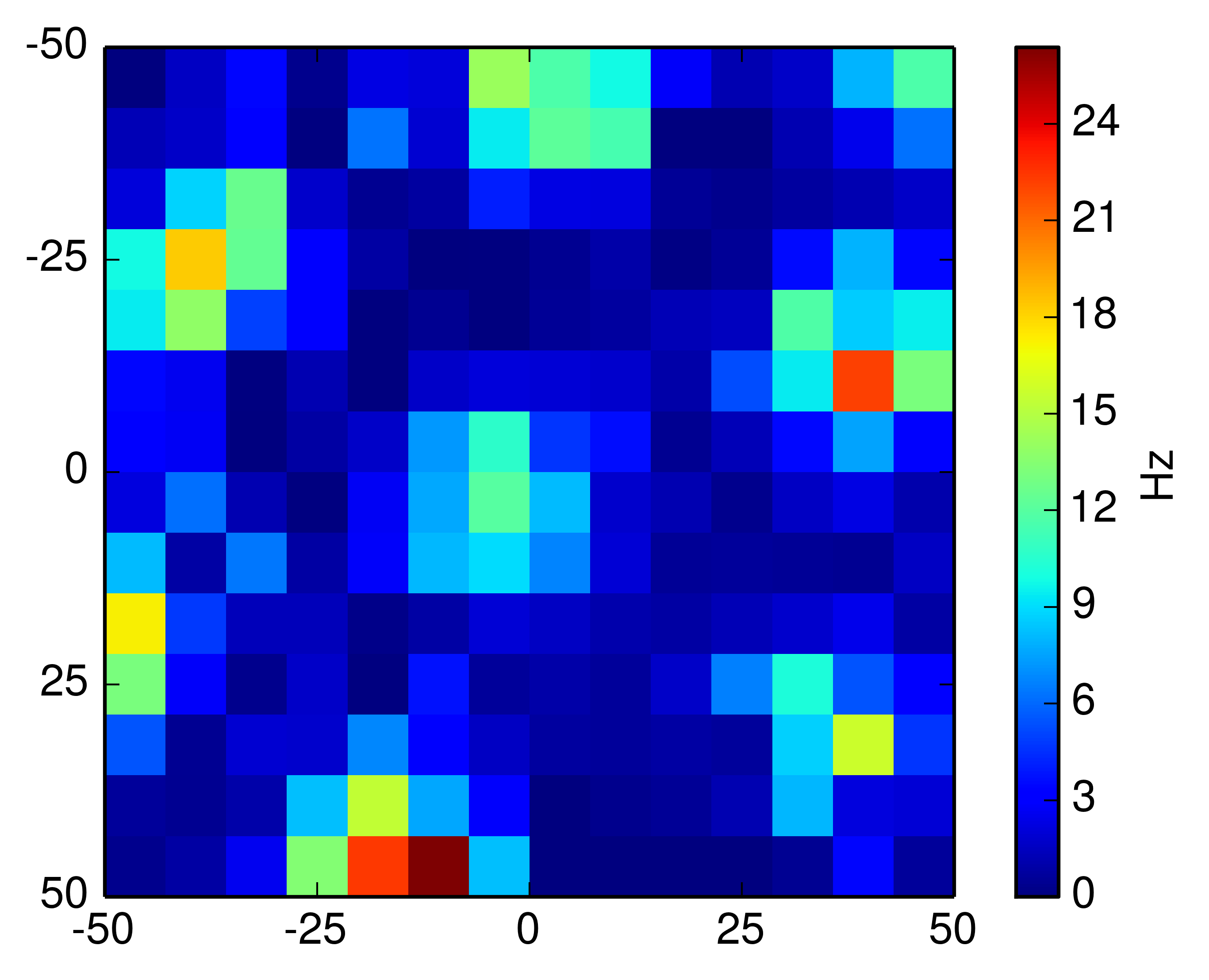
A rate map for a particular grid cell shows the firing rate of the cell as a mapping onto field the animal moves in. Some locations on the field will be preferred by the cell - it is more active whenever the animal is moving within that spatial location. A rate map shows this concept efficiently:
The data I'm using to plot is provided freely by the research group of Edvard Moser. Please see their website which has all the information and the data for available for download.
Here we use two files, 10704-07070407_POS.mat and 10704-07070407_T2C3.mat from a single trial of their experiment. The first file gives us the locations of the animal at every time point and the second file gives the spike timings for a single cell:
from scipy import io as io

# from http://www.ntnu.edu/kavli/research/grid-cell-data
pos = io.loadmat('10704-07070407_POS.mat')
spk = io.loadmat('10704-07070407_T2C3.mat')

'''
pos["post"]: times at which positions were recorded
pos["posx"]: x positions
pos["posy"]: y positions
---
spk["cellTS"]: spike times
'''
With this data we have everything we need to create the rate map. Numpy's histogram2d becomes incredibly useful in this task; we use it twice, first to compute the time spent at every location (occupancy) and then to compute the amount of spikes (activity) recorded at the locations. The rate map is the quotient of the number of spikes by the occupancy.
import numpy as np

def find_k(array,value):
    k = (np.abs(array-value)).argmin()
    return k

def rate_map(pos,spk,k=10):

    bin_edges = np.linspace(-50,50,k)

    posx = pos["posx"].flatten()
    posy = pos["posy"].flatten()
    spkt = spk["cellTS"].flatten()

    indx = [find_k(pos["post"],t) for t in spkt]
    indy = [find_k(pos["post"],t) for t in spkt]

    occup_m = np.histogram2d(posx, posy,
                             bins=(bin_edges,bin_edges))[0]
    activ_m = np.histogram2d(posx[indx],posy[indy],
                             bins=(bin_edges,bin_edges))[0]

    # every sampling point accounts for 0.02s spent at loc.
    rate_map = activ_m/(occup_m*0.02)

    return rate_map
To plot I used the following code - feel free to remove the LaTeX parts if you're missing any of the packages.
import pylab as pl

def plot_rate_map(im, nlabels=5):

    from matplotlib import rc

    rc('text', usetex=True)
    pl.rcParams['text.latex.preamble'] = [
        r'\usepackage{tgheros}',
        r'\usepackage{sansmath}',
        r'\sansmath'
        r'\usepackage{siunitx}',
        r'\sisetup{detect-all}',
    ]

    fig = pl.figure(figsize=(6,4))
    pl.imshow(im, interpolation='none')
    pl.colorbar(label="Hz")
    pl.xticks(np.linspace(0,len(im),nlabels)-0.5,
              np.linspace(-50,50,nlabels).astype('int'))
    pl.yticks(np.linspace(0,len(im),nlabels)-0.5,
              np.linspace(-50,50,nlabels).astype('int'))
    return fig
Altogether this will give the rate map above. I've put all of this together in a GitHub repository. Happy rate map plotting!